
Color can quickly transform a plain room into a striking space, but selecting the right palette is often a challenge. Follow these tips for color palettes for interior design to see how to choose interior color schemes to create your own no-fail combinations.
Start with “Your Color”
Each of us has our own distinct flair. You know what you enjoy, even if you believe you’re a Plain Jane or a Ho-hum Harry. Even if you don’t believe it, you are correct. I’ll show you. Let’s get to know one other a little better. We can begin with something small. Which color is your favorite? Mine is yellow, a bright color. Your’s may be blue, green, or red. It really doesn’t matter but it gives you a good place to start.
How to Pick a Color Scheme for the Interior

When choosing a color palette for a room, resist the urge to pick the paint color first. Because paint is affordable and can be matched to almost any color, it’s better to start with room items that are more rigid, such as furniture, fabrics, tile, or wallpaper. Then, using those elements as a guide, choose your paint colors. Here are some suggestions for narrowing down your color options when choosing color palettes for interior design.
Look for color schemes that inspire you.

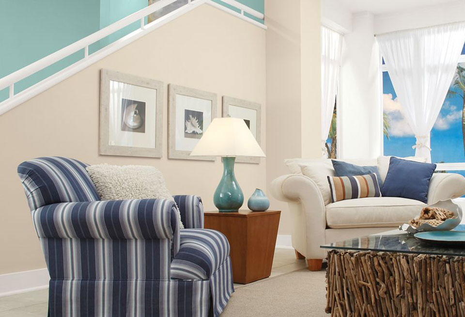
Base your color choices on an image or item you adore for a simple method to come up with a color scheme. This could be a painting, a rug, a photograph you saw online, or a patterned fabric that you like. Take select colors from the pattern and use them in your decoration choices. To develop a similarly balanced color palette, pay attention to the proportions of each shade.
Think about the color value when choosing color palettes for interior design

Don’t forget to think about value when choosing your color palettes for interior design. Value refers to the lightness or darkness of a color. A color scheme with a variety of values helps to keep a multi-hued palette from being cluttered. In each room, choose one dark color, one light color, and one brilliant color. The color that serves as the room’s primary hue is a matter of personal taste.
Create a color scheme for your home.
If you’re hesitant to use color, sketch it out first. Draw a floor plan of your home and make a list of the carpet, wall colors, and furniture that will be in each room. Collect paint chips or swatches that depict the colors of such products. Examine the rooms for both positive and negative characteristics and make a list of them. Choose focal points from the good attributes list.
Consider how one area will flow into the next, the mood you want to create, and the items that will be included in the palette. One room at a time, plan the entire house. Try using one hue in varying amounts in all rooms for an easy whole-home color palette: as a wall color in one room and an accent color in another.
Consider the Effects of Light on Colors
Pay attention to how lighting affects your color palettes for interior design. Because color is a reflection of light, the type and amount of light in a room has a big influence on the color scheme. Experiment with natural light, as well as light from lamps and recessed lighting, to see how color in fabrics, paint, furniture, and other surfaces is affected.
Daylight is regarded as the ideal light source since its intensity is essentially uniform over the whole visible spectrum of colors. As the sun’s rays travel through differing volumes of atmosphere, natural light changes from sunrise to dusk. Spend some time in a room during the day, taking note of how the changing light affects it while choosing a color scheme for it. For example, a room with solely northern exposure receives less light than other rooms in the house. To soften shadows, a warm color palette would be helpful, and it would react well to extended hours of artificial light.
In comparison to sunlight, incandescent bulbs produce a redder and warmer light. Fluorescent lighting, on the other hand, produces a bluer, cooler light. When choosing colors for a space that will be utilized largely before or after sunrise or sunset, consider the lighting in the room. Remember that any color that contains white will reflect the colors around it. A white wall, for example, will reflect the colors of the carpets, the ceiling, and even the furniture.
How to Put Your Color Scheme Into Practice
- Adding color to a place doesn’t have to imply a long-term commitment to a certain hue. If you want a neutral background, little touches or even bursts of a chosen color scheme might be used to bring color. Fabrics and textiles, such as rugs, pillows, blankets, and window coverings, are ideal for bringing color into a space while also adding pattern and texture. Artwork adds both color and charm to a room. Personal collections and accessories can provide a splash of color to your space. Don’t forget about the vibrant colors found in nature, such as flowers and fruit. They form a bright mass in any environment when arranged in vases or bowls.

- While neutrals may appear to be safe, there are numerous advantages to integrating color in your house. Color can bring various forms of furniture together and can be used to refresh aged or outdated furniture. A bold, unexpected splash of color can transform a drab room into a chic, individualized place. Color can also be used to affect your perception of space. Light colors make a small room appear larger, whereas darker colors make a large room appear smaller. A dark hue can visually lower a ceiling whereas a light color might visually raise it.

- Did you know that every year, many of the major paint manufacturers release a color of the year? Some of the design work has been done for you by Sherwin Williams, Benjamin Moore, Behr, and others.
- Pantone predicts which colors will be popular in the coming years. They are typically correct. I’m not sure how they manage it. This is an excellent place to start if you’re unsure about color. Take a look at these colors and see if any of them appeal to you.
Conclusion
You’ve probably seen those small pamphlets near all the paint color chips on the wall in your local paint store or Home Depot. While you were waiting for your paint to be mixed, you probably picked it up and flipped through it. When your paint is finished being mixed, don’t immediately put it back down. That’s a fantastic tool. While perusing the major home design magazines can be instructive and motivating, there are so many alternatives that they can easily confuse and overwhelm.
So go to the paint store on a reconnaissance mission. Grab a handful of those pamphlets. Return home and review them in the room you wish to transform.